CONTRIBUTIONS:
Research, Visual & Conceptual Development, Web Development, Web Design
TOOLS:
HTML, CSS, Javascript (isotope.js), Data API
DURATION:
4 weeks (October 2022)
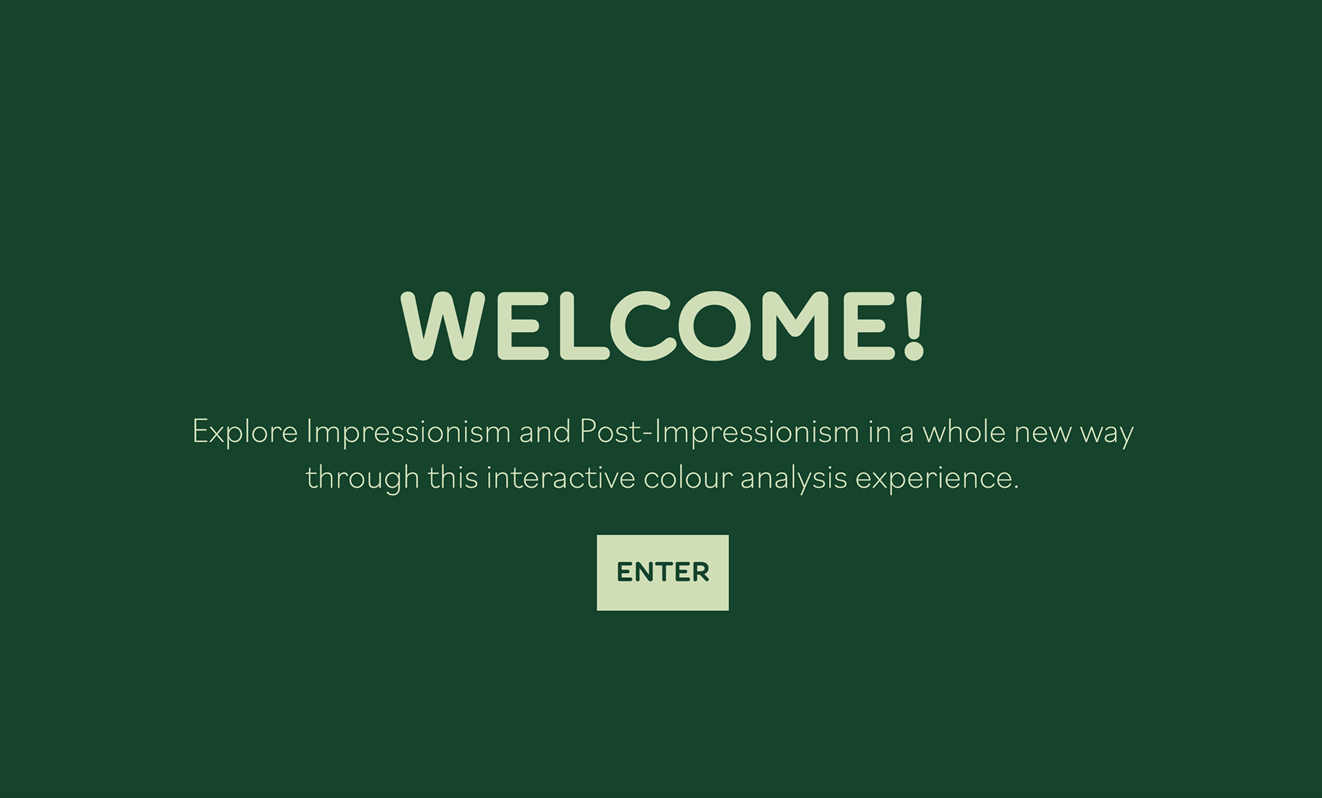
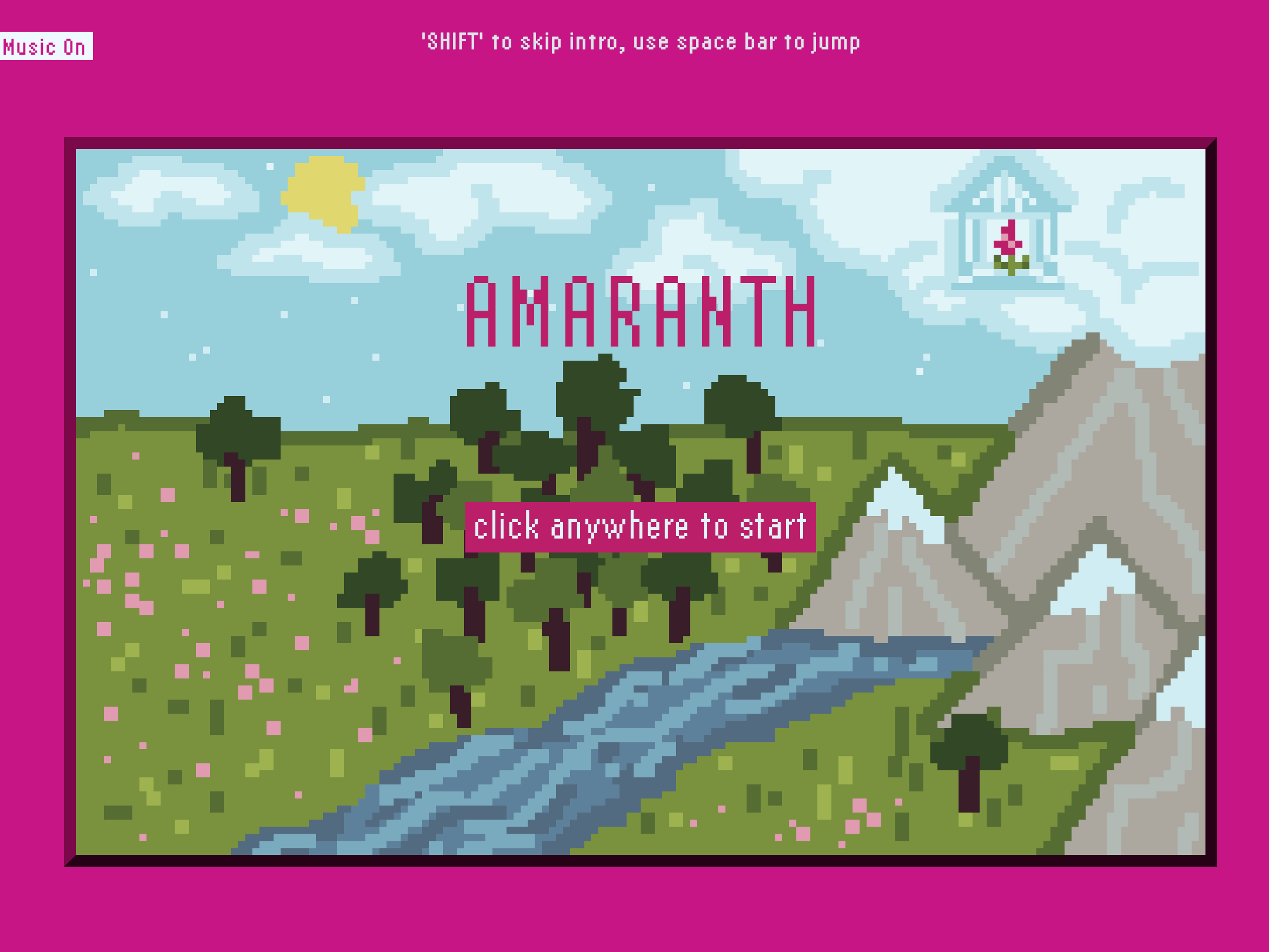
Welcome landing page.
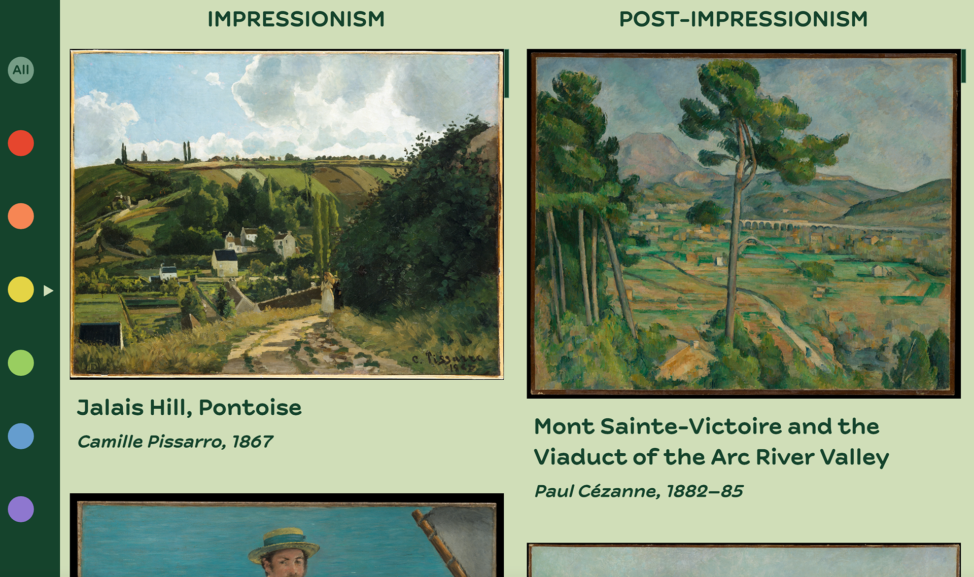
Screencap of main webpage.
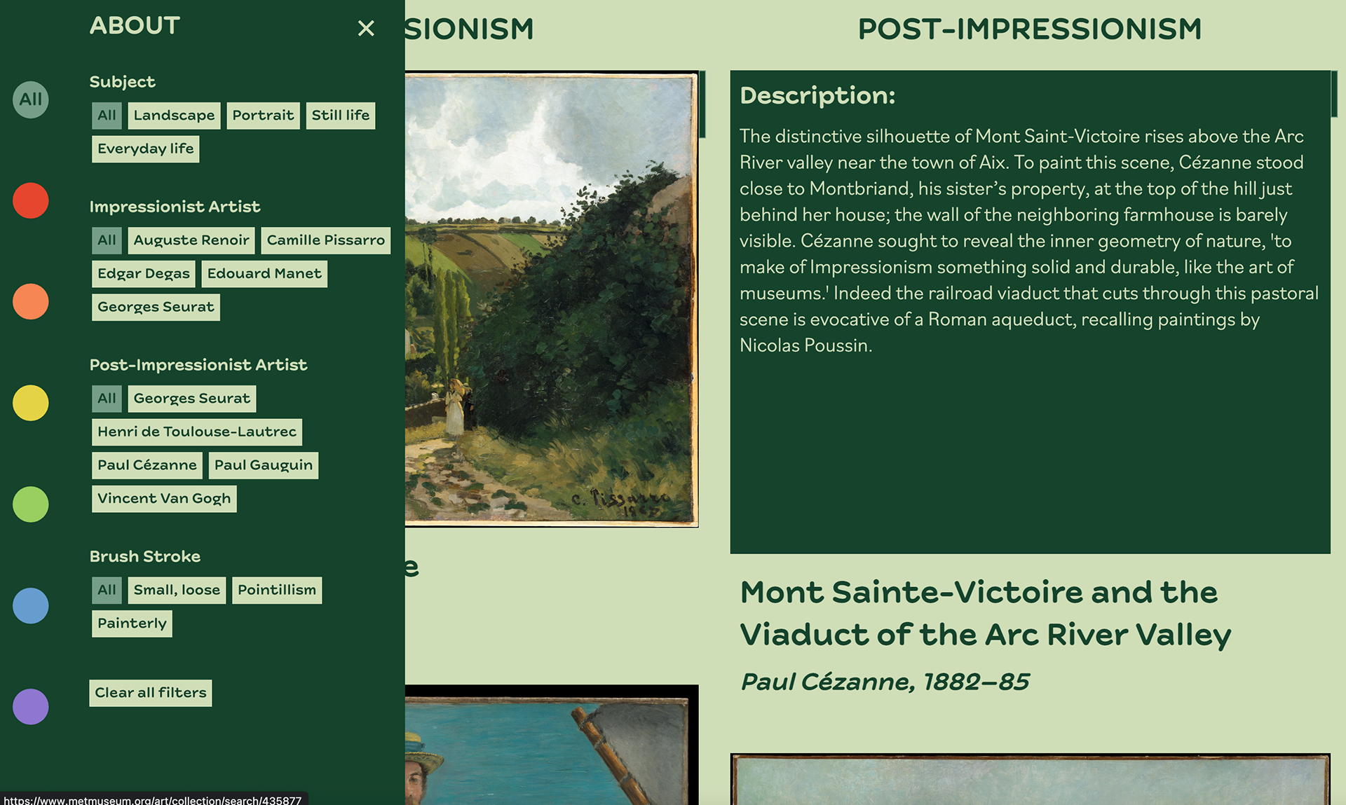
Filter options & hover effect to reveal painting description.
PROJECT SUMMARY:
For this interactive data visualization assignment I worked on for a class, I created a website that pulls data and images to display and contrast two art movements. I've always had an interest in art history and the Impressionist movement, so I chose to use the MET museum’s public API to gather images of Impressionist and Post-Impressionist paintings and turned them into an interactive comparative colour analysis website.
The goal of the website was to learn more about the similarities and differences of the two art movements with a focus on colour, as colour is significant in both. By offering a variety of relevant filters and scroll effects, I wanted viewers to be able to explore the website and its interactions to be able to compare the data and learn more about Impressionism and Post-Impressionism.
Ultimately, this project was intended to be a functional, responsive, and educational art history tool.
PROJECT BRIEF:
This interactive colour experience was created for a class. The brief was to create some form of interactive visualization that presented insights from a dataset to help answer a question about a chosen subject/theme.
TECHNICAL WRITE-UP:
This was my first time learning how to use an API and working with the isotope.js library to be able to filter through the paintings. I used HTML, CSS, and Javascript to format the page into two scrollable sections and to create a toggled filter sidebar for the purpose of comparing artists, colours, and painting styles.
I manually went through the MET database to curate pieces that made sense for this project. I then pulled the API data to my website to be able to highlight key datapoints, such as artist names, titles, dates, and so on. I also manually colour-tagged each painting based on my own interpretation to be able to filter by which colours made up a majority of each painting.